You there with no rotating text on your website. Do you want rotating text on your website? That was a rhetorical question. Of course you do. It’s objectively awesome.
It’s also an effect I’ve been playing around with on a personal website as a creative way to compress a bunch of information in a truncated space and add bit of dynamism to an otherwise static webpage. It’s a nifty little effect.
So the question is: are you a bad enough dude (or dudette) to have rotating text on your web page? Yes. Yes you are.
You don’t even need JavaScript/jQuery. It’s doable with some clever HTML5/CSS3 usage.
Step 1: On your Mark(up)s.
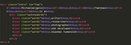
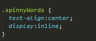
We’re going to want to arrange the text to be rotated in a group (a div or container, in my case, “spinnyWords”) in order to be able to specifically target them in one go with our CSS. Also, wrap each in <span> tags in order to style them without affecting the surrounding content.
Step 2: Styles of Beyond
We’re going to want to position and style our markup. The way it looks aesthetically is up to you, but make sure that the text is displayed inline to get the desired scrolling side-by-side effect, allowing them to segue onto the web page without disrupting anything beside it (since mine were h2’s, which usually take up the entire line as block elements, this was especially important). If your items are in a list, make sure to designate a ‘list-style:none’ to get rid of superfluous bullet points as well.
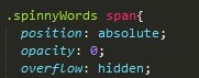
Target the spans inside your div or container to hide any overflow (you want them to disappear and reappear) and position them absolutely.
Step 3: The part where stuff actually happens.
There are a couple of CSS effects/animations that essentially do the legwork for this, and the reason why you wanted to wrap everything within your container or div in spans is that you can target them all in one full swoop.
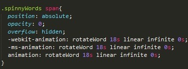
This is telling the browser to run the animation “rotateWord” on the spans linearly, running through each for 18 second intervals infinitely. Adjust settings as needed. Why did I choose 18 seconds? We’ll get to that.
Step 4: Assign keyframes/transforms to make the animation animate the way you want.
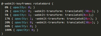
Keyframes split CSS animations into… key frames (Riveting). Transform the text along the X axis to get them to fade in and out sideways (If you want a vertical effect, simply change that value to the Y axis). Because we want the span to fade in and out, we want to make it opaque at certain keyframes and transparent in others. The opaqueness (the keyframes in which opacity is set to 1) is when the span is visible. I’ve set this to the middle (from 17%-18%) of the animation, at roughly 3 seconds of the 18 second animation time (The reasoning behind this is that I have six spans in total: 18 seconds/6 spans = 3 seconds apiece). Yours may differ. The percentages represent parts in the animation duration, with 0% being the beginning and 100% being the end. Play around with it and see what works and don’t forget vendor prefixes (just showing the Chrome one for brevity).
Step 5: ????
Run your code on your browser of choice.

What the hell happened?
I’ll tell you what happened. All your spans are animating at once. If there was a span fire, your spans would be creating a span bottleneck to block the span fire exit for everybody else. You probably don’t want that. This is why we have to individually declare a delay for each child under your main div/container so that they go one after another and not all at once. You can target each one specifically using the nth-child pseudo selector.
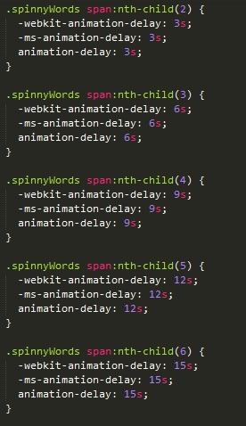
I’ve elected to give them three second breathing space each. This is also what informs how long you want to make the full animation time (Mine is 18 seconds because I have six items rotating at 3 seconds each one after another: 3 x 6 = 18). The number of items you have to rotate, along with the length of delay you want in between, will ultimately decide how long you should set your total animation length.
Step 6: PROFIT
Bask in all of your text-interchanging glory. You are now a god amongst men (and women (who want rotating text on their websites)).